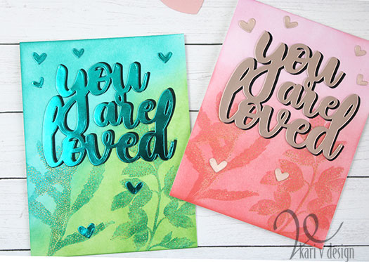
Hello! I have some cards to share in different colors today. I recently took the Altenew Course called “In The Mood For Color” and it was so interesting. She talked about the different feelings we get from color and how it changes the whole feeling of a card.
So today, I made two of the same card in different colors. First, I chose red/pink for Valentines Day! This color evokes love, passion and energy.
The Second color I chose was blue/green. Blue evokes tranquility and green is soothing & natural feeling. These are some of my favorites and I couldn’t resist pairing them together.
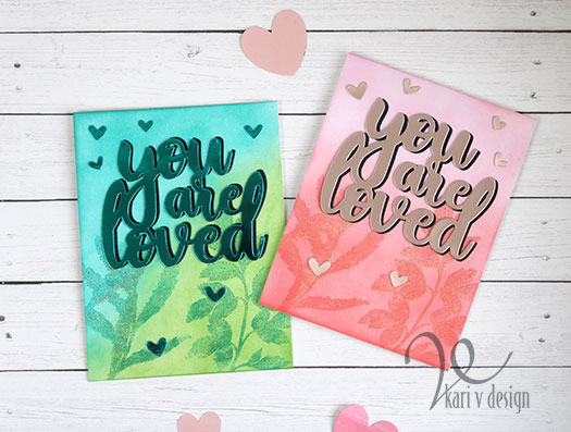
To start, I inked up the backgrounds with Distress Oxides and other hybrid inks. Then I stamped on the Leaves with a similar color. I added the dots with glitter embossing powder for more of a subtle sparkle for these cards.
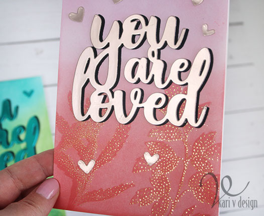
I cut the sentiment with mirror cardstock as well as some hearts. The sentiment is also backed with a black shadow.
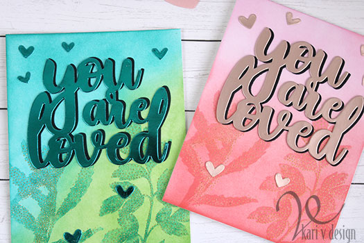
Can you tell the different feelings you get from each card? The pink card definitely has more energy, while the blue/green is more calming.
Below you can see more of the shiny mirror cardstock on the sentiment:
I’m often asked what supplies I use to make my cards, so I’ve made a list here using affiliate links when possible. If you make a purchase with these links I may receive a small commission. These help me to keep up with blog costs and continue bringing you fun projects. Thank you so much for your support!
I hope you enjoyed a look at my different color cards and hearing about the feelings color gives to a card! Thanks for stopping by!

A beautiful take on the course, Kari! Love the look of both the colours.
Thank you for entering your work to the AECP assignment gallery.